Review on Visual Studio Themes
By Lex Li
This page provides a review on Microsoft Visual Studio themes. DockPanel Suite themes follow the look-and-feel.
In this article
Visual Studio 2010 Blue Theme
Microsoft gave up Windows Forms and built Visual Studio 2010 mainly on WPF. That instantly led to a brand new theme being shipped,
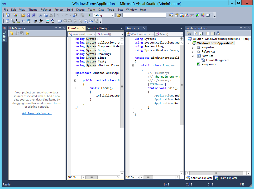
Figure 1: Visual Studio 2010 Blue Theme
It reassembles many elements of Visual Studio 2008 themes, such as rounded rectangles and icons in auto-hide tabs and tool window tabs, but also features new elements,
Gradient effect is almost removed.
More colors are utilized (especially when a visual element is hovered or pressed by mouse).
Document tabs have close buttons.
Dock target indicators are transparent.
Visual Studio 2012 Themes
When Microsoft designed Visual Studio 2012, they came across the idea to ship a light theme, as well as a dark theme, instead of the blue theme of Visual Studio 2010.
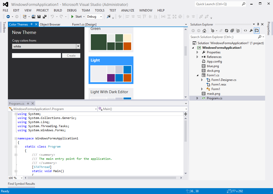
Figure 2: Visual Studio 2012 Light Theme
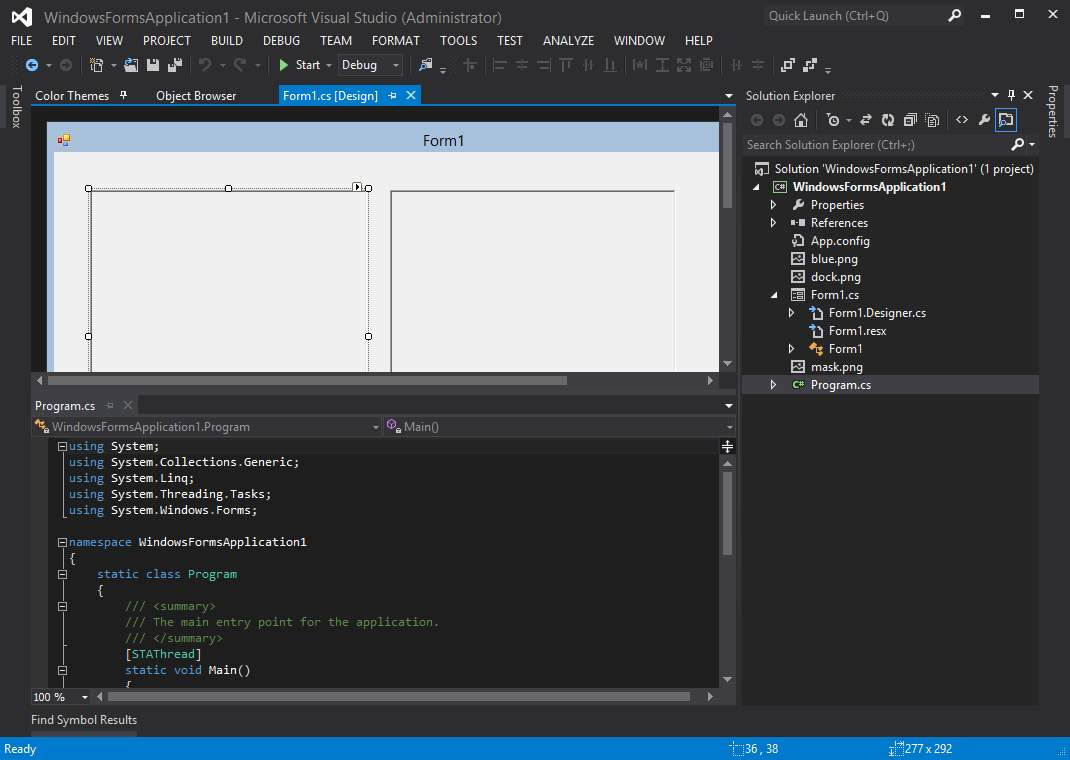
Figure 3: Visual Studio 2012 Dark Theme
There are lots of visual effect changes compared to Visual Studio 2010,
Icons are removed from auto-hide strips.
Auto-hide tabs, tool window, document tabs use simple rectangles instead of rounded.
Separators are used in tool window tabs.
Vertical splitters use a blurring effect to distinguish from horizontal ones.
By community request, in a later Update, the blue theme was also added back.
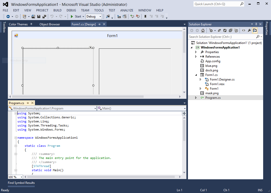
Figure 4: Visual Studio 2012 Blue Theme
The noticeable changes in the blue theme are,
Its inactive selected document tab is rendered with two blue colors. (the light and dark themes do not use this feature.)
Its vertical splitters are rendered the same as the horizontal ones.
Visual Studio 2013 Themes
Visual Studio 2013 ship all three themes by default (light, dark, and blue).
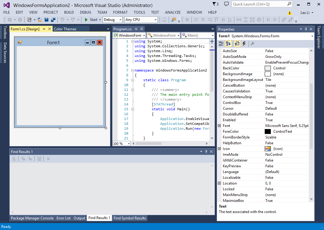
Figure 5: Visual Studio 2013 Blue Theme
This time only small changes are introduced,
A few colors have changed in the palette.
Tool window tab separators are removed.
Tool windows and documents use borders.
Splitters follow Visual Studio 2012 blue theme style.
Visual Studio 2015 Themes
Visual Studio 2015 ship all three thems by default (light, dark, and blue).
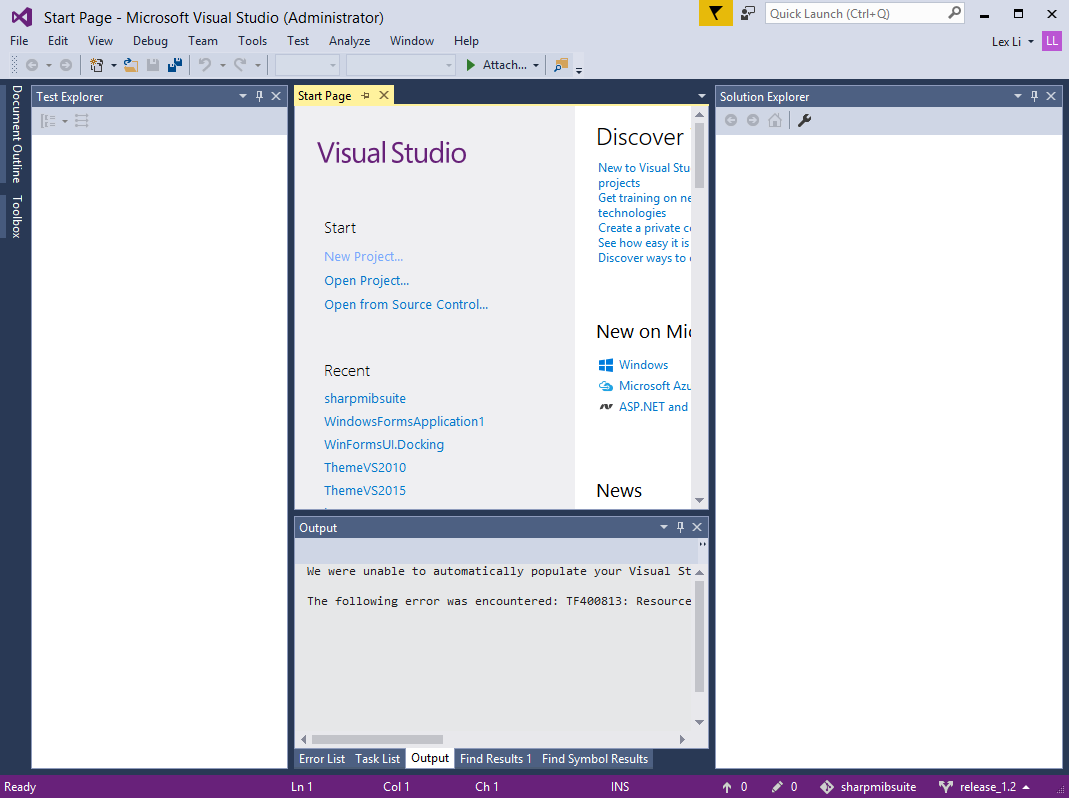
Figure 6: Visual Studio 2015 Blue Theme
This time except a few color changes in the palette, the look-and-feel is almost the same as Visual Studio 2013.
Visual Studio Color Theme Manager
During Visual Studio 2010 development, an extension was released by Microsoft for end users to design their own themes,
https://blogs.msdn.microsoft.com/visualstudio/2010/01/04/changing-visual-studios-color-palette/
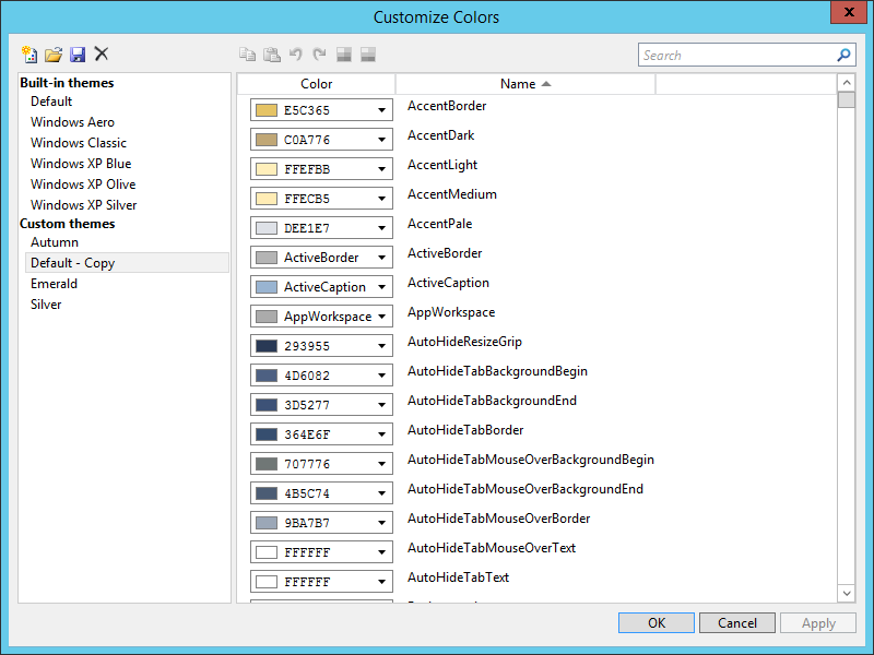
Figure 7: Color Theme Manager for Visual Studio 2010
It can import/export themes to .vstheme files in XML format.
Starting from Visual Studio 2012, .vstheme files use a completely new schema, and Color Theme Manager changes to a new design,
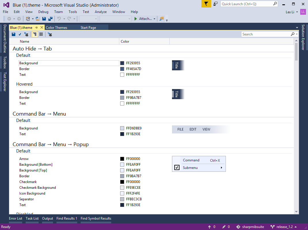
Figure 8: Color Theme Manager for Visual Studio 2012 and Above